Alberto Tallone Editore: the Art of Typography
ARTICLE IN ITALIAN >>>
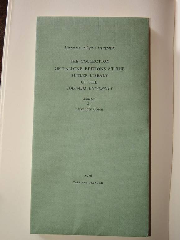
“The Rare Book and Manuscript Library of Columbia University (part of the Butler library) is the right home for my Tallone books. There, the collection will remain whole, allowing interested students and researchers to appreciate and connect the cultural wealth of literature and the aesthetic beauty of fine printing. I believe that the Tallones’ opus is particularly appropriate as the contemporary link in the great tradition of Italian fine printing from Manutius to Bodoni.”
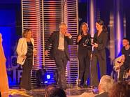
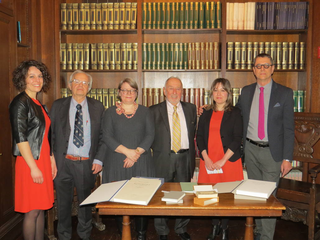
These were Alexander Goren’s words as he explained what pushed him to donate his collection to Columbia. The meeting was moderated by the newyorker Ennio Ranaboldo, a literature lover and a passionate fan of Tallone's books. The conversation focused both on the donation and on the history and importance of the publishing house. In addition to Goren, the other panelists included Eleonora and Elisa Tallone–representatives of the family–Jane Siegel who was involved in the acquisition of the collection, and Paolo Valesio, the 'Giuseppe Ungaretti Professor Emeritus of Italian Literature' at Columbia University.
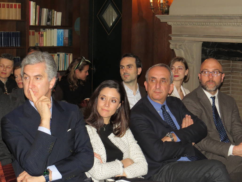
Also in attendance were Consul General of Italy, Francesco Genuardi, and director of the Italian Cultural Institute, Giorgio van Straten.
The Donation
Jane Siegel knew of Goren’s large collection of Tallone books, and she knew that the Columbia University library would be the ideal place to archive it. Siegel tells us, “These Tallone books are not only beautiful to look at, but they’re also rich in content. Some are of bibliophile copies of traditional texts; others are artists’ books and modern poetry. The collection covers the period of time from 1932 up until today. The books will now be available to students and researchers of Columbia and to the library’s visitors.”
Alexander Goren has always had a passion for books. During the presentation, he spoke about how he became a collector and how he discovered the Tallone editions.
“Since I was young, I always loved illustrated books, and I bought my first collector’s book when I was still in college. It was a German version of the 1763 Bible–a big volume. From that moment on, I began to collect antique books. One day I happened upon a book in a very unusual format. It was a Tallone edition of In Praise of Folly by Erasmus of Rotterdam. Right away, I fell in love with the graphic idea, the type, and the paper. I then entered into contact with the Tallones; I asked them for their catalog, and I began to collect their books.”
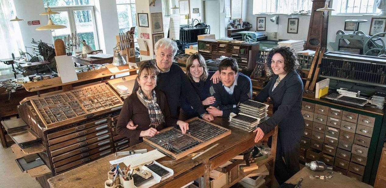
But what makes the Tallone lettering so exceptional? Eisa and Eleonora Tallone spoke to us about it, recounting their family history.
The Story of the Tallones
“The literary critic Gianfranco Contini explained that the idea that beauty can be blended together with editorial truth, it becomes alive in Alberto Tallone’s work” Elisa tells us, “Our grandfather Alberto grew up in a very fertile intellectual environment. Love for art and beauty were passed down to him since he was a young child. His father, Cesare Tallone, was a great painter. He was first a student and later a professor at the Accademia di Belle Arti di Brera. His mother, Eleonora, was a poet and friend of writers like Sibilla Aleramo and Dino Campana. When he became a publisher, my grandfather naturally felt the necessity to give a beautiful aesthetic to the books he was publishing. After his first experience in Paris as an apprentice of the typographer Maurice Darantiere, he returned to Italy in the ‘60s and founded his typographic studio.”
The Tallone Lettering
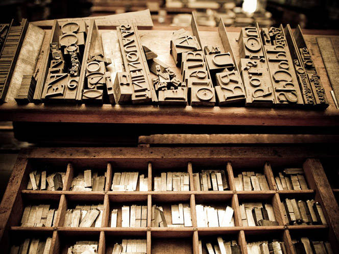
The Tallone publishing house’s volumes are put together entirely by hand, utilizing type case characters pulled from the punchcutters originally carved by great artists like Nicola Kis, William Caslon, Henri Parmentier, and Charles Malin. Eleonora Tallone spoke to us about the distinctive traits of the Tallone lettering.
“The aesthetic research behind Tallone books was never purely in the name of tradition but also for the best possible experience in reading a book. This makes our books modern, even if they were made in traditional ways. Alberto’s lesson on modernity is symbolized by the lettering that he himself designed. This lettering took inspiration from the architecture of Andrea Palladio’s Renaissance villas.”
“The Tallone type is a symbol of modernity that we continue to use because it is free of superfluous ornamentation,” continues Eleonora, “On a book’s page, nothing should distract the reader’s eye from the author’s thoughts.”
The Visual Poetry of Tallone's Books
In the time of e-books and Kindles where a lot of content, including books, is accessed online, we ask ourselves if the work of pressmen and typographers is still relevant. Professor Paolo Valesio responds to this question by referring to Tallone books and to the added value that a printed book continues to have in respect to other virtual methods of reading.
“In reality, printing is still very relevant,” Valesio explains to us, “Printing has its own poetry, a visual poetry. There are studies that deal with how the graphics of a book’s page influence the way we read. Tallone shows how both the writing’s aesthetics and its layout affect our reading. The Tallone catalog includes the classics of Italian poetry such as Dante, Petrarca, Boccaccio, and Leopardi, but it also contains some volumes of scientific and engineering work that are poetic in a certain sense. They have a poetic aesthetic that is precise and well-thought-out.
Even Ennio Ranabaldo praised Tallone’s typographic art: “The immense beauty and legibility of the page gives the reader satisfaction that is not only intellectual but also visible. A Tallonian page and its lettering bring us inside that page and make us more attentive readers.”
A Successful Typography
Interest in typography is still very alive. This is confirmed by the Tallones’ great success in both Europe and America, which is guaranteed by the uniqueness of Tallone’s volumes.
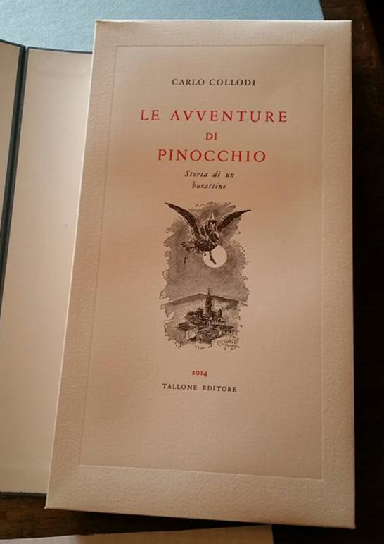
“The Tallone type remains faithful to itself,” Elisa Tallone highlights, “But we look to give each book its own format, and this distinguishes our style from others. For example, for the edition of Pinocchio, we utilized a sky blue paper that is representative of the Fairy with Turquoise Hair. We also rely on craft paper mills that may be small but work with great quality.”
The Tallones garner a lot of attention here in America. Outside of New York, the publishing house is also very present in San Francisco. Elisa spoke to us about it:
“San Francisco is the other big book capital in America that we’ve been going to since the ‘80s. We’ve recently had two shows: one at the State University where we presented our collection and one at the Italian Cultural Institute. Here in New York, we have a series of meetings planned to try to organize new presentations and establish new collaborations.”
This stresses, yet again, how important and historic printmakers are anything but dead. They still have much to tell us about our time through their visual poetry.


















i-Italy
Facebook
Google+
This work may not be reproduced, in whole or in part, without prior written permission.
Questo lavoro non può essere riprodotto, in tutto o in parte, senza permesso scritto.